Unveiling Our New Brand Identity
We are thrilled to announce a significant milestone in our journey—our transition from “Prestige Sales Company” to simply “Prestige.” This change is more than just a new look; it reflects our evolving mission, values, and the diverse range of services we offer. In this blog post, we’ll walk you through the thought process behind our rebranding, from our new logo to our chosen color pallet.
Why “Prestige”?
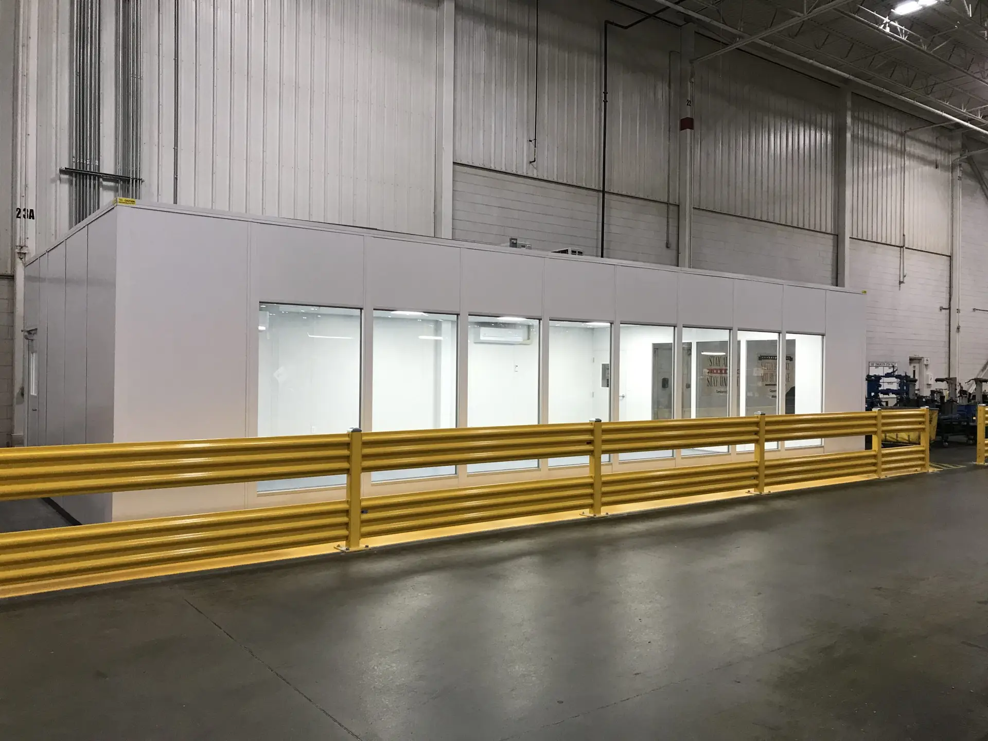
The shift from “Prestige Sales Company” to “Prestige” is a strategic move to encapsulate our growing range of services. Initially, our journey began in 1970 when James O. Westbrooks founded the company in Chattanooga, TN, to serve the dairy and cold storage industry. The first line of products, branded as “Prestige”, marked the inception of a legacy in providing top-notch storage equipment, freezer room clothing, and raw consumable products. While we started as a sales company, we have expanded into complete system design, turn-key installation, automation, preventive maintenance, and more. The slight adjustment in our name offers us the versatility to grow and adapt in an ever-changing industry.
OLD LOGO
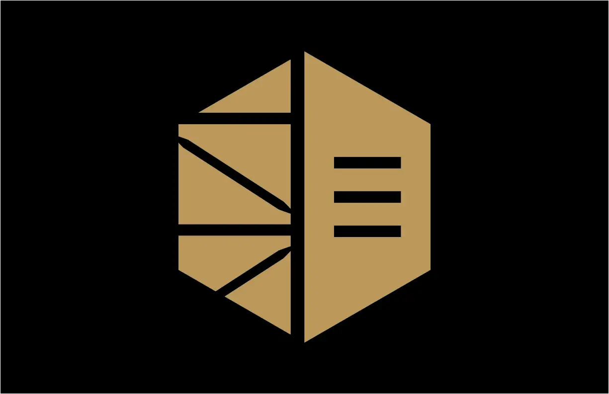
NEW LOGO
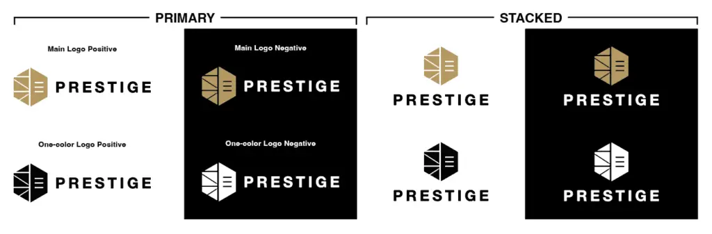
Versatile Logo Variations
The Prestige logo is designed with flexibility in mind to suit a variety of applications. Our Primary Logo, characterized by its horizontal layout, is perfect for website headers, business cards, and official documents, offering a bold and recognizable presence. The Stacked Logo adapts to different layouts for more compact spaces without losing the brand’s essence, ensuring consistent recognition.
We’ve created one-color positive and negative variations, available in both primary and stacked formats. These variations maintain their impact against diverse backgrounds, offering a cohesive visual identity that aligns with Prestige’s modern approach.
Decoding the New Logo
Our new logo is a blend of carefully chosen elements, each adding a layer of meaning to our brand identity:
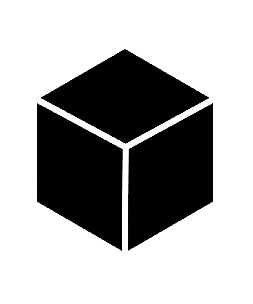
Solid Cube
The cube stands for stability, strength, and foundational integrity. It’s a shape that’s often associated with building blocks, suggesting that we provide essential, foundational solutions that are both robust and reliable. The angles of the cube symbolize our multi-faceted approach to problem-solving, illustrating that we look at challenges from all angles—a quality that sets us apart from our competitors.
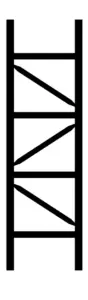
Racking Pattern
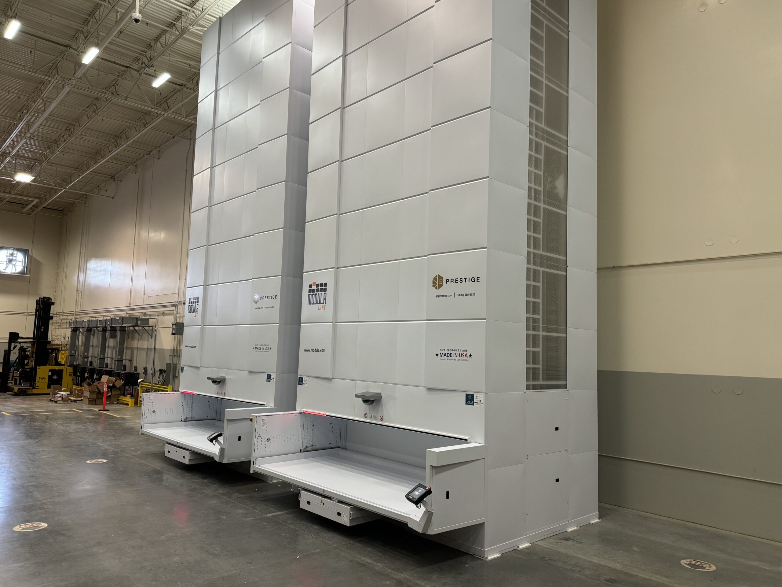
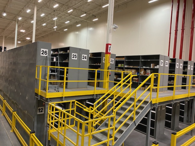
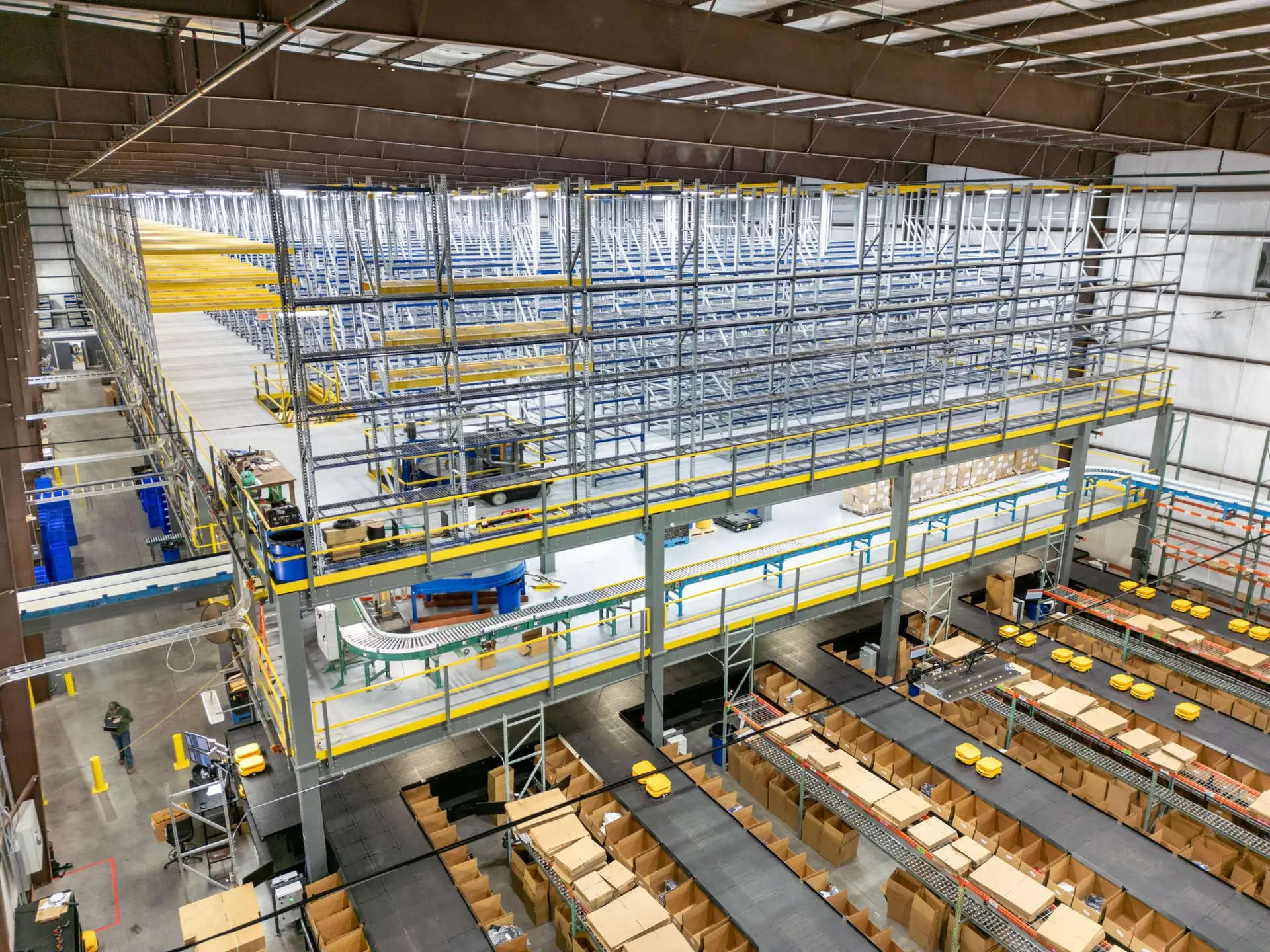
This pattern directly alludes to our expertise in storage solutions and warehouse systems. It serves as a nod to our roots in storage solutions while also pointing to our future, where we continue to innovate in storage and beyond. Storage will always be a significant part of what we do, anchoring our brand in a core competency while we expand into new areas.
Our rebranding is not just a change in visual identity but a reaffirmation of our commitment to excellence, innovation, and customer satisfaction. We are excited about this new chapter as “Prestige,” and we look forward to continuing to serve you with the same dedication and quality that you’ve come to expect from us.
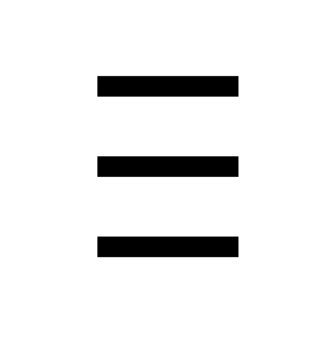
Three Lines
These lines serve multiple purposes. They can represent the different levels or tiers of storage, suggesting our versatility and adaptability in storage solutions. In the digital world, three lines often symbolize a menu or list, which hints at our comprehensive range of organized services. Additionally, the sequential lines can signify growth and progress, emphasizing our commitment to helping clients optimize their operations. They also subtly nod to automation and vertical lift modules, key aspects of our innovative offerings.
Final Result – The Prestige Shield
The “Prestige Shield” is a representation of our company’s steadfast commitment to delivering quality and innovation in the industry. Combining the Cube, the Racking Pattern, and the Three Lines, this icon embodies our core values and the comprehensive range of services we offer. It signifies a strong foundation, a deep-rooted expertise in storage solutions, and a readiness to adapt to the evolving demands of the industry, including advancements in automation and vertical lift modules. As we transition into a new phase, the Prestige Shield reaffirms our dedication to maintaining high standards of excellence and fostering long-term partnerships with our clients.
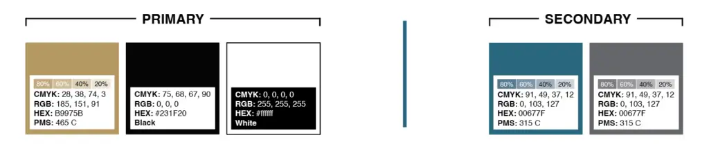
Our Brand Colors
As we transition into a new era, our color palette has been updated to reflect both our heritage and our future aspirations. Our primary colors are gold/tan, black, and white. The gold/tan is a representation of the high-quality and reliable services we are known for.
We’ve chosen to retain blue as a secondary color, a slightly altered shade from our previous branding, to maintain a connection with our legacy. It will be prominently featured across our website and other marketing materials. Complementing it is Cool Gray, a color that brings a professional and balanced aspect to our brand’s visual representation.
Moving Forward with Prestige
As we introduce the refreshed Prestige brand, we want to emphasize that this change is more than just a new look. It reflects our ongoing commitment to providing precise, efficient, and reliable services in the industry.
Our partners – We will be in touch soon to send you the updated brand elements. In the meantime, please feel free to reach out if you have any questions.